Imagine a bustling marketplace of letters where people from many eras and locations come together to exchange tales. Every font family has a unique voice that engages and appeals to our senses. While the handsome little ornaments known as serifs sashay with grace, the sleek sans-serifs stomp with modern flair. They all combine to provide a lovely symphony that brings our written words to life. Together, they weave a complicated web of narratives and emotions using only the placement of glyphs, which they do expertly. So join me, my friends, as we explore the intriguing world of typography and expose the mysteries that are concealed in our everyday language.
Elements of Typography
Today, we’re diving into the beguiling depths of the typographic ocean, seeking out the shimmering pearls that are the main elements of typography. Each element, a crucial component of this intricate ecosystem, lends its unique charm to the typographic seascape.
Typeface
We have the typeface – the individual character, with all its quirks and idiosyncrasies – that defines the aesthetic vibe of our underwater adventure.
Font Family
Next, we encounter the font family, a bustling school of typefaces that, much like a kaleidoscope of fish, dance together in visual harmony.
Kerning and Leading
Drifting further along, we find kerning and leading, those subtle yet vital forces that maintain balance and harmony among the glyphs. Kerning and leading, the dynamic duo of typography, are the key elements that give our text harmony and balance. Think of kerning as a master sculptor who carefully carves the space between each character, shapes our words, and ensures that they are aesthetically attractive. As a skillful architect, leading, on the other hand, creates the vertical space between lines of text, creating a solid base of comfort and legibility for our readers. Together, these two strong forces turn our writing into a carefully choreographed ballet, in which each letter and line performs with grace, coherence, and purpose. So let’s learn more about kerning and leading and admire the artistic skill that makes our text both aesthetically pleasing and simple to read.
Tracking
Now with tracking. Picture tracking as the subtle art of managing space between characters, ensuring our text flows smoothly and maintains readability. As sentences stretch across the page, tracking acts as a skilled conductor, orchestrating a symphony of balanced spacing. Sometimes, tracking calls for a touch more space to lend elegance to headlines or create a sense of airiness. At other times, it tightens the gap, allowing letters to come closer and form snug, compact clusters. So, let’s appreciate the vital role of tracking in typography, the unsung hero that ensures our words remain visually harmonious and reader-friendly.
Hierarchy and scale
And lastly, we marvel at hierarchy and scale, the dynamic forces that bring order and clarity to our textual landscapes. Picture hierarchy as the skilled director, thoughtfully casting each character in a role that highlights its unique importance, guiding the reader’s attention through the story of our design. Meanwhile, scale steps into the spotlight as the versatile stage designer, setting the scene with an array of sizes and proportions that create depth, drama, and contrast, ensuring our message resonates with the audience. Together, hierarchy and scale work in harmony to orchestrate an engaging, immersive experience for our readers, turning the written word into a visual symphony. So, let’s celebrate the transformative impact of hierarchy and scale in typography, and appreciate the artistry that makes our messages both compelling and accessible.
Alignment
Alignment, the underlying principle that gives our typographic works their structure and coherence. Imagine alignment as our text’s symphony’s expert conductor, directing the exact placement of each line and ensuring that they march across the page in perfect harmony. Each technique has its own unique charm and function, whether it’s the regal elegance of left-aligned text, the serene balance of center alignment, the sleek modernity of right alignment, or the rhythmic vitality of justified text. Alignment creates a sense of cohesion and order throughout our designs, making it simple for the reader to follow the progression of our message. So let’s celebrate the importance of alignment in typography and the art of creating visually appealing and simply comprehensible compositions.
Main Kinds of Typeface
Each typeface with its own unique charm and personality, enriching the visual language of our designs. Imagine these typefaces as characters in a grand play, each delivering their lines with distinctive flair and emotion. First, we have the elegant serifs, the aristocrats of typography, gracing our pages with their refined, classic appeal. Next, the modern sans-serifs enter the scene, showcasing their clean, minimalist allure that captivates the contemporary eye. We then meet the expressive script typefaces, whose fluid, handwritten strokes dance gracefully across the stage. Lastly, the whimsical display typefaces burst onto the scene, delighting us with their bold, eye-catching presence and boundless creativity. Together, these distinct kinds of typefaces bring our textual stories to life, weaving a rich tapestry of visual communication. So, let’s appreciate the diverse artistry of these main typeface categories and celebrate the magic they bring to our designs.
Serifs
Serifs, the graceful rulers of typography, endow our designs with their enduring refinement. Imagine serifs as the elegant aristocrats of the alphabet, ornamented with their tasteful accents that lend our text a sense of coziness, heritage, and grace. These eminent characters wear their serifs like crowns, giving the written word an air of legitimacy and dependability. These types continue to rule supreme in the field of typography, from the regal Old Style serifs with their roots deeply rooted in the early days of the printing press to the refined Transitional and contemporary Didone serifs. So let’s honor the regal serifs and value their long history and timeless attractiveness in our designs.
Sans-serifs
Sans-serifs are the streamlined, contemporary chameleons of the typographic world. Consider sans-serifs as the avant-garde fonts of the alphabet, eschewing their elaborate ornamentation in favor of crisp, simple lines that convey a sense of clarity and simplicity. These unadorned characters command attention with their clean, modern flare and ease into a variety of design environments. Sans-serifs are living proof that sometimes less really is more, from the geometric accuracy of Futura to the humanist charm of Gill Sans and the utilitarian appeal of Helvetica. So let’s admire sans-serifs’ unwavering capacity to breathe modernity into our designs and enjoy their seamless sophistication.
Script
The master calligraphers of the typographic world are script typefaces. Imagine script typefaces as the alphabet’s poets, their beautiful dance of fluid, handwritten strokes dancing across the page. With their artistic flair, these graceful figures enchant our designs and evoke feelings like the romance of a sincere love letter or the charm of a wacky handwritten message. These talented writers enthrall our readers with their expressive, individual touches in a variety of scripts, from the formal ease of brush script to the relaxed ease of formal script. So let’s cherish the fascinating feelings that script typefaces add to our projects and celebrate their seductive beauty.
Display
The bold and creative stars of the typographic stage are display typefaces. Imagine display typefaces as the bold explorers of the alphabet, not afraid to challenge conventions and make a statement with their distinctive, striking forms. Whether it’s the quirky appeal of hand-drawn lettering or the dramatic effect of a bold, futuristic typeface, these passionate characters pour life into our designs, infusing them with personality and flair. Display fonts demonstrate that the world of typography is an unending playground of creativity, ranging from wacky novelty types to strong, attention-grabbing headlines. Let’s therefore rejoice in the mesmerizing enchantment of display typefaces and recognize their limitless ability to awe and enchant our visual senses.
The Difference Between Typeface And Fonts
Let’s demystify a common conundrum in the world of typography: the distinction between fonts and typefaces. Imagine typefaces as the imposing ensembles of a play, with each group of players delivering their lines in a distinctive, unified manner that establishes their collective character. Contrarily, fonts are like the various costumes worn by the actors, each with a unique quality that contributes to the vividness of the characters.
In simpler terms, a typeface is the overarching design of a set of characters, encompassing their shared visual features and aesthetic traits. Fonts, however, are the specific variations of a typeface, such as its weight, style, and size. So, while a typeface is a creative expression of a designer’s vision, a font is the practical tool that brings that vision to life on the page or screen.
Let’s celebrate the harmonious interplay between typefaces and fonts, and appreciate the intricate dance that makes our typographic creations both visually captivating and functionally versatile.
The Power of Typography: How Design Can Make or Break Your Message
Typography is an essential aspect of design that can make or break a message. It’s the art of arranging typefaces in a visually appealing manner to communicate a message effectively. In today’s digital age, with an abundance of information available at our fingertips, typography plays a vital role in capturing the attention of the audience and conveying the intended message.
Picture typography as the enchanting storyteller, weaving a rich tapestry of visual language that brings our words to life and captivates our audience. The right typeface becomes the voice of our message, evoking emotions and stirring feelings, while the clever use of hierarchy and scale ensures our story unfolds with clarity and purpose.
However, this delicate balance can be easily disrupted. Poorly chosen typefaces, inadequate kerning or leading, and a lack of attention to alignment can derail our message, leaving our audience lost in a labyrinth of visual chaos. The smallest misstep in our typographic choices can create discord and confusion, transforming our once harmonious message into an indecipherable cacophony.
So, let’s celebrate the power of typography and appreciate the crucial role it plays in conveying our message. By mastering the artful nuances of typefaces, layout, and design, we can ensure our words resonate with impact and grace, creating an unforgettable experience for our readers.
From Gutenberg to Google Fonts: A Brief History of Typography
Typography has come a long way from the days of Johannes Gutenberg’s printing press to the digital age of Google fonts. Gutenberg’s invention of printing with movable type in the 15th century revolutionized the way people communicated and disseminated information. The first typeface was created in the 18th century, and the evolution of typography continued with the advent of digital technology in the 20th century. Today, there is a wide range of typeface options to choose from, and designers have the freedom to customize them to their liking.
Trends in Typography: What’s Hot and What’s Not in Graphic Design
Like any other design element, typography is subject to trends. Some popular trends in typography in recent years include:
- Sans-serif fonts: These clean, modern fonts have become increasingly popular, especially in tech and startup branding.
- Bold typography: Bold, striking typography is a great way to make a statement and grab attention.
- Handwritten fonts: These fonts give a personal touch to design and add a warm, authentic feel.
On the other hand, some outdated typography trends include:
- Fussy, ornamental fonts: These fonts are overly ornate and can make a design look outdated.
- Overused fonts: Fonts like Comic Sans and Papyrus have been overused to the point of becoming cliché.
The Art of Typography for Logos: Crafting a Memorable Brand Identity
Typography plays a critical role in creating a memorable brand identity. A well-crafted logo should reflect the brand’s personality and values, and typography is a powerful tool for achieving this.
Today, let’s delve into the captivating world of typography for logos, where artful letterforms and ingenious design blend to create memorable brand identities that leave a lasting impression. Picture the art of logo typography as a skilled conductor, orchestrating a symphony of characters that resonate with the brand’s unique essence and melody.
Imagine a whimsical bakery logo, where the name “Sweet Harmony” is spelled out in a delectable script typeface, each letter adorned with intricate icing-like swirls that dance across the design. The playful, artistic strokes evoke the joy of indulging in a delightful treat, while the pastel color palette evokes a sense of warmth and comfort, inviting patrons to savor the bakery’s sweet creations.
Now, picture a powerful logo for an eco-friendly technology company called “Green Innovations.” The bold, geometric typeface forms the foundation of the design, while delicate leaves sprout from the letterforms, symbolizing the company’s harmonious blend of nature and technology. The logo conveys a sense of progress and sustainability, reflecting the brand’s commitment to shaping a greener future.
Or consider the enchanting logo for a bookstore named “Mystic Pages.” The letters are crafted from a serif typeface that exudes the charm of an antique typewriter, while subtle flourishes and a celestial motif weave a sense of magic and wonder throughout the design. The logo captures the enchanting allure of immersing oneself in the pages of a captivating novel, transporting readers to far-off worlds and timeless adventures.
Each of these imaginative stories highlights the transformative power of typography in logo design, showcasing how the artful combination of typefaces, shapes, and creative vision can forge a visual identity that not only defines a brand but also captures the hearts and minds of its audience.
Typography for Business: How to Use Design to Enhance Your Marketing Strategy
Let’s explore the influential role of typography in the realm of business…
…where strategic design choices can elevate your marketing strategy and leave a lasting impact on your audience. Picture typography as the secret weapon in your marketing arsenal, carefully crafting a visual language that speaks directly to your target demographic and resonates with their desires and aspirations.
Imagine a high-end fashion brand launching an ad campaign for its latest collection. By employing a sophisticated, elegant serif typeface, the brand evokes a sense of luxury, exclusivity, and timeless appeal. The carefully chosen typeface, combined with a minimalist layout and an opulent color palette, sends a clear message to the audience: this brand represents refinement and indulgence.
Now, envision a tech startup promoting its innovative app through a series of eye-catching social media posts. The use of a clean, modern sans-serif typeface conveys a sense of simplicity, efficiency, and cutting-edge innovation. Paired with bold, contrasting colors and engaging visuals, the typography speaks to the company’s forward-thinking approach and commitment to user-friendly design.
Or consider a health and wellness brand seeking to inspire potential customers with motivational quotes and tips for leading a balanced lifestyle. By utilizing a combination of warm, inviting script typefaces and clean, legible sans-serifs, the brand creates a sense of harmony and approachability, reflecting its mission to make wellness accessible to all.
Each of these scenarios demonstrates the power of typography in the business world, showcasing how the thoughtful use of typefaces, layout, and design elements can strengthen your marketing strategy and create a lasting connection with your target audience. By mastering the art of typography, you can effectively communicate your brand’s message, captivate potential customers, and leave an indelible mark on the competitive landscape.
Here are some tips for using typography in business design:
- Use typography to convey your brand’s personality: The font you choose can say a lot about your brand’s personality and values.
- Make sure your typography is legible: The primary function of typography is to communicate a message, so it’s essential to ensure that the font is readable.
- Use typography to create hierarchy: Creating a visual hierarchy using different font sizes and weights can help guide the viewer’s eye and emphasize important information.
Typography for Blogging: Tips to Improve Your Content’s Readability and Engagement
Typography can significantly impact the readability and engagement of your blog content.
Imagine writing a captivating blog post on the latest interior design trends. To make your content more accessible and engaging, you choose a clean, legible serif typeface for the body text, setting the stage for a comfortable reading experience. You then employ a contrasting sans-serif typeface for headings and subheadings, skillfully guiding your readers through the post while creating a sense of visual hierarchy.
Now, envision using the power of scale and whitespace to break up long paragraphs and emphasize key points. By adjusting font size and line spacing, you create an inviting, airy layout that encourages readers to dive into your content, rather than being intimidated by a dense wall of text.
Or consider employing a touch of color and creative formatting to highlight important quotes, statistics, or call-to-action elements. By using these subtle design techniques, you draw your readers’ attention to crucial information, while simultaneously adding visual interest and variety to your post.
Each of these tips showcases the potential of typography in the blogging world, demonstrating how the artful combination of typefaces, layout, and design elements can transform your content into an engaging, reader-friendly experience. By mastering the art of typography for blogging, you can effectively communicate your ideas, captivate your audience, and elevate your content to new heights of readability and engagement.
Here are some tips for using typography in your blog design:
- Choose a legible font: Make sure the font you choose is easy to read, especially for longer pieces of content.
- Use white space: Adding ample white space between paragraphs and lines of text can improve readability and make your content more visually appealing.
- Emphasize key points: Using bold or italicized text to highlight key points can help make your content more scannable and engaging.
An Overview of Typography: The Science Behind the Words We See
Typography is more than just aesthetics – there is a science behind it. The way we read and process text has a significant impact on typography design. For example, studies have shown that sans-serif fonts are easier to read on screens than serif fonts. Additionally, font size, line spacing, and line length can all impact readability. Understanding the science of typography can help designers create more effective and engaging designs.
In conclusion, typography is an essential aspect of design that has a significant impact on a message’s effectiveness. Typography has come a long way, from its historical development to the most recent trends in graphic design. Typography is an effective tool for developing enduring brand identities, optimizing marketing plans, and increasing the readability and engagement of content. Designers may produce compelling and effective designs that convey the intended message by having a better understanding of the science behind typography.
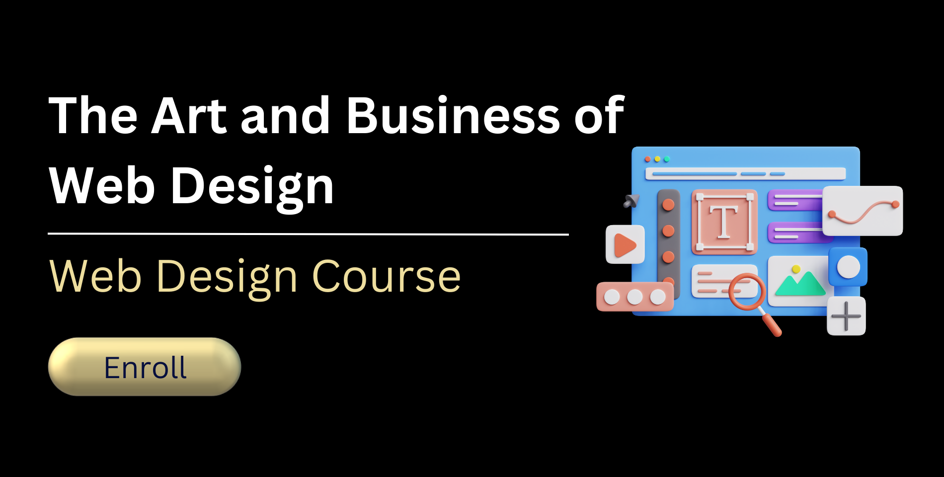
We’ve got a cool offer for you to level up your digital design skills with our laid-back course, “The Art and Business of Web Design.” For a limited time, you can snag a sweet discount on this easygoing learning experience, designed to help you become a web design whiz. Embrace your creative side as you dive into typography, get cozy with color theory, and navigate the world of responsive layouts. Our friendly instructors will be with you every step of the way, sharing their insights and helping you hone your skills in crafting visually captivating and user-friendly websites. So, why not give it a go and elevate your web design game? Enroll now and join us on this chilled-out adventure into the world of digital artistry. Learn more about The Art and Business of Web Design Course